Mozilla Weave – synchronize Firefox among multiple computers

This entry is part 2 of 3 in the series Fixing Firefox

Anyone who uses multiple computers has the struggle of maintaining productivity across different environments. Web browsers store passwords and bookmarks and preferences on each computer. Wouldn’t it be nice if there were a way to have each computer automatically synchronize your bookmarks and passwords?

Image from mozillalabs.com/weave

Image from mozillalabs.com/weave

If your browser of choice is Firefox, you’re in luck. A product from Mozilla Labs called Weave is currently in the final round of betas for it’s maiden version 1 release.

Here’s the official description from the Weave site.

As the Web continues to evolve and more of our lives move online, we believe that Web browsers like Firefox can and should do more to broker rich experiences while increasing user control over their data and personal information. Weave is a Firefox add-on that is aimed at exploring this opportunity.

Weave is a plugin you install on Firefox on each computer you use. Weave then uses a very secure method of synchronizing your encrypted passwords, bookmarks, tabs, history, preferences, add-ons and personas to the Weave server. These types of synchronized data give it a leg up on the other player in this space, Xmarks (formerly Foxmarks), which only synchronizes passwords and bookmarks. Xmarks also has a social element, tracking your history and suggesting sites. Weave simply ensures that your experience is the same as you move from computer to computer.

Weave supports Fennec, the version of Firefox for mobile devices. We’re looking forward to the release of Fennec for Android so the experience is the same among our computers and our devices.

We’ve been using Weave since it was initially announced as version 0.1. For a while they weren’t accepting new registrations. It’s been very fast and easy to use, and now that it’s in beta Weave is accepting new users.

Here’s how to get it. Select Tools > Add-ons and search for Weave in the add-on search. When you install the plugin and restart Firefox, you’ll be presented with a box to create a new Weave account. Enter your preferred user name and password. You’ll then need to enter an encryption key that is in addition to your password. This key ensures that your data can’t be accessed by anyone other than you – including the folks at Mozilla. It’s quick and painless and you’ll be up and running in no time.

Are you still using Xmarks? Will you switch to Weave? Why or why not? Let us know in the comments.

Posted in software, services | Tagged , , , , |

Reclaim screen real estate with Firefox tweaks

This entry is part 1 of 3 in the series Fixing Firefox

Mozilla Firefox is an open-source web browser that is popular for its security, third-party add-ons called extensions, and it’s speed relative to the current dominant browser Internet Explorer. Today we embark on a three-part series about making Mozilla Firefox usable.

Stock Firefox uses a ton of space at the top

Stock Firefox uses too much space at the top

Our biggest beef with web browsers today is the amount of space used by the browser. For every pixel the browser uses for title bar, menus and other components, one fewer pixel can be used for the browser’s primary function of displaying web pages. This need for thin browsers is especially apparent on netbooks, where vertical pixels are at a premium. As shown above, a stock installation of Firefox uses a ton of unnecessary space from the top of the title bar to the start of the web page. Fortunately, Firefox can be made to take up the least real estate of any browser, and all it takes is a few simple steps.

  1. Rearrange the buttons
  2. Turn off the Navigation and Bookmarks toolbars
  3. Turn of unnecessary tabs
  4. Install Classic Compact extension

1. Rearrange the buttons
Let’s begin. Step one is to rearrange the buttons. As you can see in our starting screenshot, there is a bunch of extra space in the menu bar – space enough to include the complete contents of the navigation bar, especially when you consider that most of us use Firefox on wide monitors. To make the change, click View > Toolbars > Customize. Once the customize dialog box is open, you can simply drag and drop the buttons and the address and search boxes from one location to another.

2. Turn off the Navigation and Bookmarks toolbars
Once everything is moved out of the Navigation toolbar, you can turn it off. We like to turn off the bookmarks bar as well, as we’d much rather have the extra space than the training wheels that are browser bookmarks. If you like the bookmarks, you might consider installing the Tiny Menu add-on which replaces the menu items with a single drop-down menu, allowing you the space to merge your bookmarks to the menu bar just like the navigational elements.

Here is a screencast showing steps 1 and 2 in action.

Turn off unnecessary tabs in Firefox

Turn off unnecessary tabs in Firefox

3. Turn off unnecessary tabs
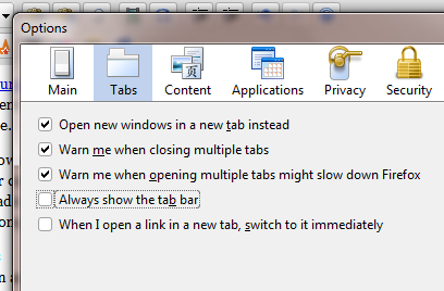
Older versions of Firefox didn’t show the tabs bar unless there were more than one tab open. Recent releases of the browser now show the bar, even if you’re only using one tab. This annoyance is easy to fix. Click Tools > Options and then select the Tabs section. Uncheck “Always show the tab bar” as shown here.

4. Install Classic Compact
The last part of the screencast shows the checking of the ‘Use Small Icons’ box, but for our tastes that option doesn’t go far enough. Fortunately there is a third-party add-on called Classic Compact that does a great job of making the buttons use enough space to be useful and no more. Installation is very simple. Click Tools > Add-ons and search for “Classic Compact” in the Add-ons search box that comes up. Once you install it, you’ll be prompted to restart Firefox.

After completing these four steps, you’re leave with a very lean browser that properly devotes as much space as possible to the content you’re viewing. Here’s our finished product.

Firefox optimized

Have you figured out how to optimize other browsers? Let us know in the comments.

Posted in community | Tagged , , , , , |

Google Picasa provides fast and easy photo management

Picasa
Image via Wikipedia

Sometimes there is a piece of software that is so obvious for a specific need that we make assumptions. We assume that everyone uses it and, if not, that those who don’t at least know about it and for some unreasoned purpose decide to use something lesser. A few products fit this description, but in our minds none more so than Google Picasa.

Picasa manages your photo collection. It sounds like a simple description of a simple task, but if you’re using anything less than Picasa you have no idea what this description means. We’ll touch on some highlights here, and finish up with both Google’s official video and the reason you may want to be cautious about using Picasa if you’re an auctioneer looking for ways to manage pictures for your inventory.

To start with, Picasa is very focused specifically on photos. It doesn’t work well with graphics or clip art; it does neither vector nor pixel-level bitmap edits like Illustrator or Photoshop, respectively. If you took a picture with a camera, that picture belongs in Picasa.

Picasa isn’t really content working with individual directories of images on the fly. Like iTunes, Picasa wants the entire workflow occur within the program, which you load first before you access and interact with your content. Unlike iTunes, Picasa is somewhat less pernicious and bloated in the way it handles controlling your tasks.

Picasa assumes that you’re going to plug in your camera and use Picasa to transfer the images from your camera to a location selected by Picasa. Picasa pulls the meta data from the pictures – information such as date taken – and sorts the pictures accordingly. Just in case you somehow (gasp!) get pictures on your computer through a means other than Picasa, the folder manager constantly watches the places on your computer most likely to receive new pictures so these additions can be quickly added to Picasa’s collection.

Once Picasa has your photos, you’re able to do just about anything you can imagine. Image adjustments and enhancements from brightness and contrast to red-eye to cropping are all a simple click away. Uploading images to Google’s Blogger service or Google’s Picasa Web is a one-click task, allowing you to easily and immediately share your pictures with the world. The option to order physical prints of your pictures generates an option list that reads like a who’s who of picture printing vendors.

Picasa's facial recognition in action

Picasa's facial recognition in action

By far and away the most impressive feature of the latest release of Google Picasa, version 3.5, is the facial recognition. Picasa 3.0 was advertised to have face recognition, but we honestly never figured out how to use it. Not so with Picasa 3.5. The top of the left navigation pane now features a people section. In this section, Picasa automatically close-crops the faces from all your photos and groups them together for you to name. Once Picasa connects to your Google account, your Google Contacts synchronize with Picasa to make associating contacts with the face groups as easy as selecting from a drop-down menu. Once you’ve associated a face with a name, future pictures indexed by Picasa with that person will generate a match suggestion, shown in the graphic on the right as the question mark in the orange circle, which you can confirm or deny. Picasa learns and adapts to increase the accuracy of future groupings.

Picasa’s face recognition will own you. Easily more addicting than the most captivating of games, we lost an entire weekend to tagging our catalog and making sure each face was correctly identified. It’s now trivial to locate every picture in our collection containing a specific person.

Picasa is an amazing photo management tool that makes simple editing lightning fast. Fast picture editing is an auctioneer’s dream, but there is one slight road bump that takes some getting used to. We mentioned above how Picasa wants to manage your collection. As auctioneers, we want to take a folder of pictures for an event and process everything in that folder. While we always continue to store images for posterity, once the auction is over we don’t necessarily need to be bothered by those old images, so maintaining them in our collection isn’t really ideal. Picasa needs to index a directory before it will allow you to perform actions on it, and even when you select a specific image and ask to edit in Picasa, it may take a while before Picasa gets around to indexing that directory.

Equally difficult to understand is the way Picasa exports content. Unlike most other batch-processing image manipulation programs like Arles Image Web Page Creator or Irfanview, Picasa doesn’t allow you to set a relative export directory. That limitation means that instead of saying that you want to save all your pictures in a sub-directory of the original folder, Picasa requires that you browse the directory structure to select an export location. This can be a very annoying process with which to become accustomed.

Google Picasa is unquestionably the best tool to manage your personal photo collection. Because it’s free and an all-in-one tool, we believe it to be also much superior for business than the GIMP or Photoshop combined with Arles or Irfanview that most auctioneers currently use, especially once you become accustomed to the workflow changes.

We’ve touched on the highlights. Here’s the video from Google if you’re interested in seeing Picasa in action before giving it a try.

Are you sold on Picasa? Get it for free from picasa.google.com. Are you scared of the face recognition features? Are you confused or frustrated by the imposed workflow changes? Are you a fan of a lesser photo management system like iPhoto or Windows Live Photo Gallery? Let us know in the comments.

Posted in software | Tagged , , , , |

Motorola Droid

The Motorola Droid officially dropped yesterday. It’s the first of several Android-powered devices coming to the Verizon network. Here’s a quick list of relevant phone features.

  • 3.7″ capacitive touchscreen, 480×854 resolution
  • 5 mega-pixel camera with flash, zoom and focus
  • 16 GB storage card, 256 MB of system RAM
  • Horizontal slider with on-screen and physical keyboards
  • Wi-Fi, Bluetooth, GPS, e-compass

Apple iPhone, Motorola Droid and Palm Pre

Apple iPhone, Motorola Droid, Palm Pre

The Motorola Droid is less a phone with smart capabilities and more of a computer with phone capabilities. I’ve had my Droid for just over 24 hours, and this review will primarily compare the Droid with the Apple iPhone and Palm Pre. I’ve been using the Pre since June, and while I don’t have an iPhone, I do use an iPod Touch and am familiar with the app store and interface. I’m staying away from comparisons with Windows Mobile and BlackBerry, in my mind the current fourth- and fifth-place smart phone platforms, respectively. I believe neither platform is anywhere close to as powerful, usable, professional or advanced as Apple’s iPhone, Palm’s WebOS or Google’s Android.

Appearance
This phone is beautiful. The iPhone and Palm Pre each has a resolution of 320×480 pixels. The Droid has a resolution of 480×854. The Droid has as many pixels across as the iPhone has vertically. For those of you doing the math at home, that’s over 2.6 times as many pixels as the iPhone. Indeed, the Droid’s vertical resolution is even greater than most netbooks.

20091029_021
Image by tnkgrl via Flickr

The physical shape is perfect. It’s large enough that it doesn’t feel cramped and yet small enough to not cause you to look like you’re holding a computer to your ear. The edges are crisp and industrial looking, and the body sports a flat black finish.

Phone
This phone is loud. I don’t remember the last non-corded phone that I could hear without complaining or constantly pressing the increase volume button on the off-chance that I bumped the decrease volume button in the two seconds since the last time I hit increase volume. I can’t make a call comfortably with the Droid at full volume. Not only is the experience right for the Droid user, the transmitted volume level is stronger as well. In one of my first calls, the other person told me to be careful not to be too loud when I was speaking. The Droid improves other people’s experiences.

This phone is heavy. It’s not uncomfortably heavy in a way that will make you tired when you’re using it. It’s heavy in the sense that it feels great in your hand and isn’t going to blow away. One of my complaints the Palm Pre is that it’s too small, too light and feels cheaply constructed. The Droid isn’t any of these things.

This phone gets service. It’s on the Verizon network, widely accepted as the carrier with perhaps not the fastest data network, but certainly the widest coverage area. Verizon’s recent purchase of Alltel means that their coverage is superior in the Midwest, especially in rural areas.

Future-proof number portability is assured with complete integration with Google Voice. I’ve covered Google Voice here before, but until now my usage of Google Voice when mobile was limited to using clunky apps that initiated voice calls by having Google Voice call back or by calling Google Voice and navigating the dial prompts. Google Voice on the Droid actually results in a change to the phone’s native dialer so you don’t have to think about using Google Voice before making calls. Now, the only time I’ll have to remember my Verizon number is when I’m dealing with Verizon; the Google Voice number shows on caller ID, not the Verizon number.

Internet and data functions can’t be used at the same time as the phone or SMS functions. It’s not a fault of the Droid or the Android but rather of the current CDMA network itself. The CDMA coverage in the Midwest is so much better than GSM, however, that this limitation is barely worth mentioning.

Mobile office
The Droid is the perfect business device. Must-have features such as Microsoft Exchange/Outlook support and a removable battery mean that this phone can be your connection to your office. I haven’t had the phone long enough to make a comprehensive comment to battery life, but so far it seems to be much better than the Pre’s battery.

Official tethering support is coming in 2010, meaning it can serve Internet to your computer. If you don’t want to wait, and you have a Windows computer, June Fabrics has a version of PdaNet for Android that will tether without hacking.
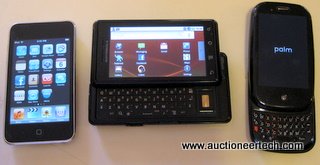
iPhone, Droid and Pre

Apple iPhone, Motorola Droid, Palm Pre

The enormous 5 MP camera has auto focus, zoom and dual-LED flash. There is a dedicated camera button located where a standard point-and-shoot would have the shutter trigger button. This button on the Droid also serves to launch the camera app, so a picture can be taken at any time simply by a long-press on the camera button to load the camera application and then pressing the button to take the picture. The included 16 GB storage card provides a ton of space for these high-resolution images that are so easy to take. The camera supports DVD-quality (720×480) video capture, and a third-party application called Qik allows instant, live streaming video to the web at the press of a button. Another application, called Shopsavvy, allows the camera to scan product bar codes, showing you product offerings based on proximity or price.

Applications are a joke if you can only use one at a time. The Android’s multitasking isn’t quite as intuitive as the Pre’s, with no clear way to understand which apps are running or to quickly switch back and forth between them, but it does allow multitasking and I have yet to be confused or even take any issue with the application switching in Android.

The Droid does turn by turn directions. For free. The news in late October of Google’s free GPS application destroyed the stock of Garmin and Tomtom. The share price of each went down 16% and 21%, respectively, in one day. I think it’s safe to say that the mapping and GPS on the Motorola Droid are more advanced than any other portable device.

I have never found voice recognition useful. Even products such as Dragon Naturally Speaking have came up short for even my most basic of hopes, to say nothing of providing functionality that is beneficial enough to integrate into my work flow. I had the Droid for over 8 hours before I noticed the microphone icon, prominently displayed in the primary search bar on the Android desktop. I touched it and was presented with a prompt that said speak now. I said “directions to Medicine Lodge”. It didn’t load the browser. It loaded the GPS application and automatically began directing me to Medicine Lodge, Kansas. I said “call Diane Poe” and it called my fiancĂ© without even prompting me to confirm my intentions. Other inquiries are converted immediately to Google searches with the results immediately presented. Unlike every other voice recognition program I’ve ever used, the Droid’s voice command actually works in a useful way.

Entertainment
The Droid comes with the Amazon MP3 store, a very mature and robust marketplace for DRM-free albums and songs. The music player is feature-complete, unlike the Palm Pre, and the Google Listen application brings podcast support that simply embarrasses the iPod Touch.

The phone’s speaker is much louder than any other device’s speaker. Listening to music at full volume in a room is almost so loud as to be slightly unnerving.

The Android Market is a mature app store, unlike the store for the Palm Pre. While it may not have as many applications as the Apple app store, we’ve found an app for every function we’ve needed. Loopt, Last.fm and Qik were nowhere to be found on the Palm Pre. They all work flawlessly on the Droid.

Droid vs Pre
Where does the Droid fall short against the Palm Pre? The Droid doesn’t have a mirror. The Droid is a horizontal slider, which isn’t nearly as convenient as the vertical sliding keyboard featured by the Palm Pre. The Palm Pre’s operating system is very intuitive when it comes to multitasking. There isn’t an easy way to zoom out and see previews of the multiple applications that are running in Android at the same time. As I mentioned, it hasn’t been a problem so far since everything in Android is intuitive enough to use without difficulty.

OREM, UT -  NOVEMBER 5: A manager holds an App...
Image by Getty Images via Daylife

Droid vs iPhone
Where does the Droid fall short against the iPhone? There is no question that Apple has the app store lead, closing in on 100,000 applications while the Android Market houses just over 10,000 apps. The app count isn’t as important, as I mentioned, since there seems to be an Android app for everything I’ve imagined so far. The iPhone does have a robust desktop management application in the form of iTunes, but the days when syncing your device to your computer with a cable was the cool thing to do should be long behind us.

Summary
The Motorola Droid is quite surely the most remarkable device I have ever seen. The physical keyboard, multitasking and high-resolution screen place the Droid squarely ahead of the iPhone, and the quality construction, call quality and Android Market apps are easily enough to best the Palm Pre. All the other features in the article above simply widen the lead against the other competitors.

Posted in hardware, gadgets | Tagged , , , , , , , , , , |

The end of the sitemap as we know it

This entry is part 2 of 3 in the series All things must end

Back in the days of the FAQ and the image map (remember when you would hover your mouse over a picture and different parts of the graphic would link to different pages?), web designers used a website element known as a sitemap or site index. Modern sitemaps are valuable tools that are submitted to search engines. Sites that still make sitemaps available to the public as navigational elements are behind the times.

When most of us think of a site map, we still think of the link in the footer that takes us to a page that lists all the pages on a site. It used to be the case that sites were so unusable due to browser incompatibilities or lack of developing with web standards that some pages were simply not accessible or not findable by some users without the use of a site map. As such, their use became a trend that in some circles persists to this day.

The problem is that nobody uses them any more. In 2002, a study by useit.com found that 27% of users utilized a site map. That’s a high number, but not when we learn that they were specifically asked to “learn about a site’s structure.” In 2008, the same study found that the number had dropped to 7%.

A user seeing a large list of links isn’t going to have any reference as to the value of those links. Your carefully-designed click-stream, your conversion goals and, most importantly, the user experience are all compromised. Designing using web standards with clear and well-organized navigation that is void of usability land mines such as drop-down menus or Flash navigation will improve accessibility and put the final nail in the coffin of the already-obsolete site map as we know it.

The phrase “as we know it” is important because modern sitemaps are very important for search engine visibility. A sitemap, in the eyes of a search engine, is a carefully crafted XML file that is uploaded or made available on your site. This sitemap has information in it that specifies the page location, the last time the page was modified, how often the page changes and how important the page is. Here’s an example from the official sitemap protocol page at sitemaps.org.

<?xml version=”1.0″ encoding=”UTF-8″?>
<urlset xmlns=”http://www.sitemaps.org/schemas/sitemap/0.9″>
<url>
<loc>http://www.example.com/</loc>
<lastmod>2005-01-01</lastmod>
<changefreq>monthly</changefreq>
<priority>0.8</priority>
</url>
</urlset>

As you can see, a modern sitemap is nothing like the old sitemaps from when the web was young.

Sitemaps in Google Webmaster Tools

Sitemaps in Google Webmaster Tools

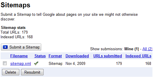
There are programs that will generate your sitemap for you. They crawl your site and present you with a list of your pages. You then go through these pages and rank them by priority and specify how frequently they change. The program will give you the sitemap file when you can then upload to your favorite search engine. Google’s Webmaster Tools has a Sitemaps section. WordPress and other popular blogging and content management tools have plugins that will automatically generate a sitemap.xml file for your site and submit it to Google. Our AuctioneerTech site map section is shown here.

Don’t let yourself get charged extra for sitemap submission – it’s not an add-on service. Sitemap submission is an integral part of building modern websites and should happen before any website project can be considered complete.

If you’re working with a web developer, make sure he/she is submitting a sitemap.xml file to search engines. Also, don’t forget to make sure that you leave the link list safely in the past where it belongs and off of your public website.

Posted in design, websites, theory | Tagged , , , |